Exponential Growth of Virus: Updated 4-20-2020

In the article below, we discuss the exponential growth and eventual decline of the coronavirus pandemic.
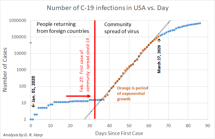
Gerry Harp, who is a former director of SETI research at this Institute, noted that the plots made available to the public showing the number of new virus cases are generally presented on graphs with a linear vertical axis. But for something that’s growing exponentially, a logarithmic scale would be a better choice – certainly for scientists.
Harp collected data from the CDC on new virus cases in the U.S. up through April 19, and plotted them on a semi-log graph (above.) You can see the bending towards a slower growth rate for new cases.
This is a better way of displaying the data for an exponential process.
-- Seth Shostak
By Seth Shostak, Senior Astronomer
The spread of the coronavirus will be exponential – which is bad. But its inevitable decline will also be exponential, which is good.
Astute readers of media will have noticed that in the last two years the use of the word “exponential” has suddenly become fashionable. In the majority of cases, a writer will use it to mean “a lot”, as in “streamed video content has grown exponentially.”
But of course, the word is historically grounded in algebra, and was first used by Descartes to describe, for example, something whose growth with time can be characterized as ta, where a is the exponent. A simple example would be Moore’s Law: If the number of transistors on a chip doubles every two years, that’s an exponentially increasing improvement.
In the case of the coronavirus, the growth in the number of infected persons will inevitably be exponential, at least for a while. That’s because the rate of new infections clearly depends on the number of people who are already contagious. The resulting tally of the infected will increase very rapidly – as is typical of exponential growth. Note that it’s not that the number is large, but only the behavior of the growth rate that merits the designation “exponential.”
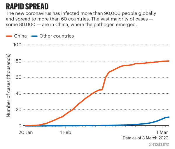
And, as noted, that’s clearly bad. The accompanying graph, from Nature magazine, shows the total number of coronavirus cases in China (red curve). It rises rapidly and for awhile is exponential – with a doubling time of about a week during early February. But a glance at the plot shows the number of cases leveling off by mid-February. If this were a graph of new cases rather than total cases, the curve would have turned over, and headed back down.

And since the number of new cases also depends on the number of infectious people (which declines as folks recover), that will also be exponential, but exponentially decreasing.
Bottom line; While the bad news grows rapidly, the good news will also evolve rapidly. So let’s just hope that by invoking sheltering-in-place and other strategies, we can reduce the infection rate and cause the inevitable bell-shape curve of the number that are sick to turn over sooner.


